
Vital Call App
Vital Call’s key product is a personal alarm pendant and emergency call service for at-risk groups. As a student project of the UX Design intensive at General Assembly, we were assigned the challenge of expanding the utility of the subscription-based service and finding ways to increase customer engagement.
Timeframe
Two week sprint
Team
3 UX Designers
Methods
Competitive analysis, surveys, interviews, ideation, prototyping and user-walkthroughs
Competitive context
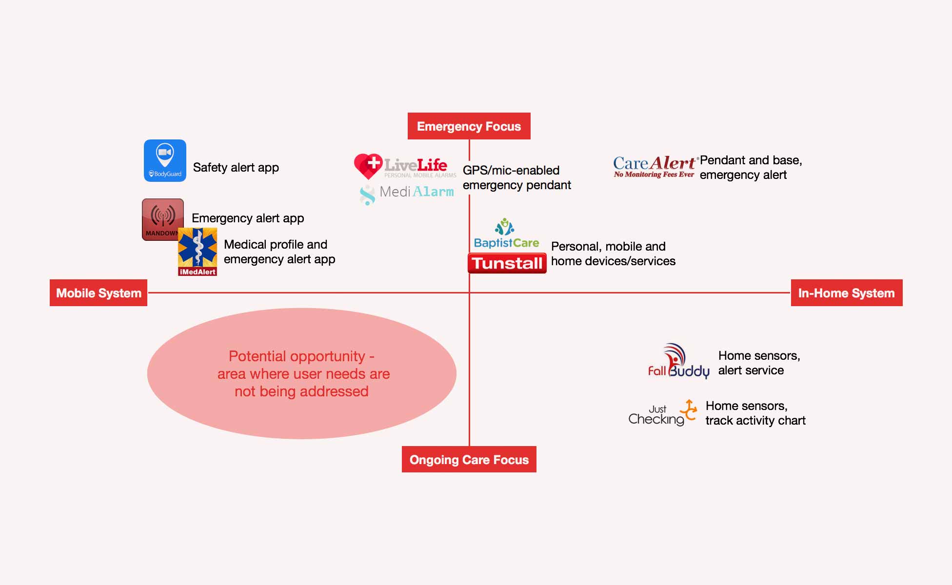
Looking at Vital Call’s competitive environment, the emergency care sector is crowded, with similar products charging only a one-off fee for their service. Vital Call needs to increase the value it offers the customer to justify its subscription model.
Understanding the people
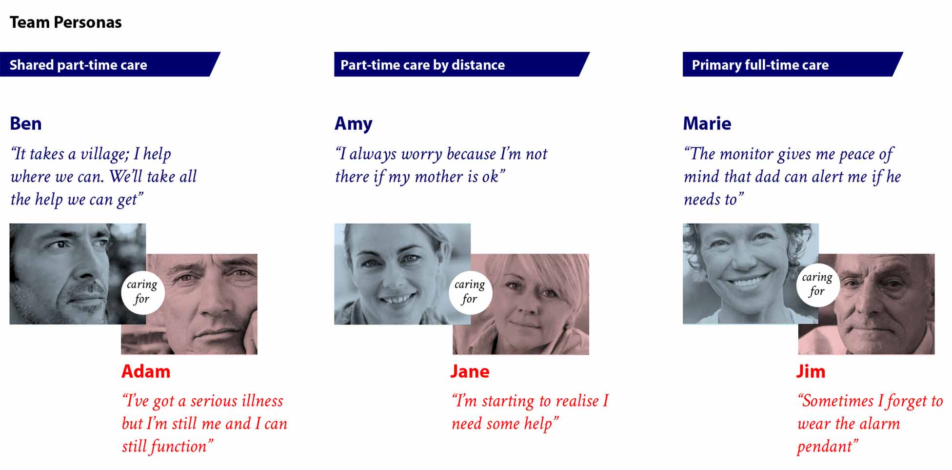
We interview carers to better understand the dynamics, communication and decisions around providing care. Care recipients were difficult to gain access to due to their vulnerability, so we consulted secondary sources such as care workers and reports.

We learnt from the carers that the carer mindset is always on – carers have difficulties balancing their home, work and care responsibilities; they often neglect their own needs and they find it hard to attain peace-of-mind about their loved one. On the care recipients side, we learnt they don’t want to be treated like children and they don’t want to relinquish control. We were hit by the realisation that the current service is passive in nature – it relies on the care recipient raising the call for help, when this is the last thing they would do.
Hypothesis
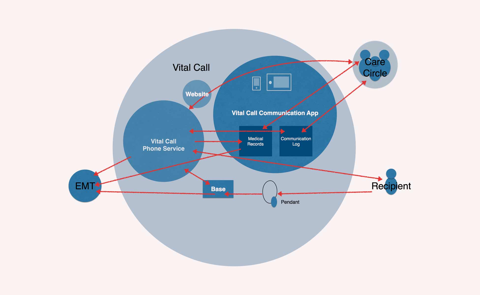
If we evolve Vital Call’s service to provide support on an ongoing basis, reluctance to use the service will decrease, because Vital Call will already be a familiar and trusted care partner.
With high-tech healthcare technologies still in their experimental stages, we found it prudential to focus on a solution with a human service component that allows room to further evolve the tool in the future.
For this reason we proposed an app as a centralised communication tool combined with a phone check-in service that provides further support.
Proof of concept
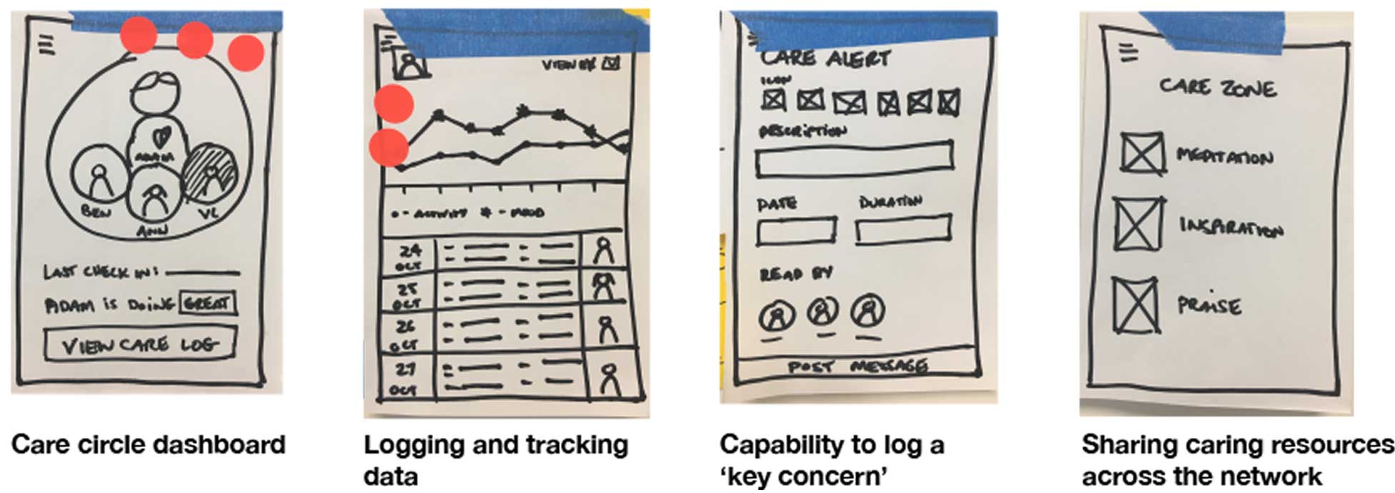
After some feature prioritisation and several rounds of time-boxed sketching, we have concepts on paper to walkthrough with our target group.
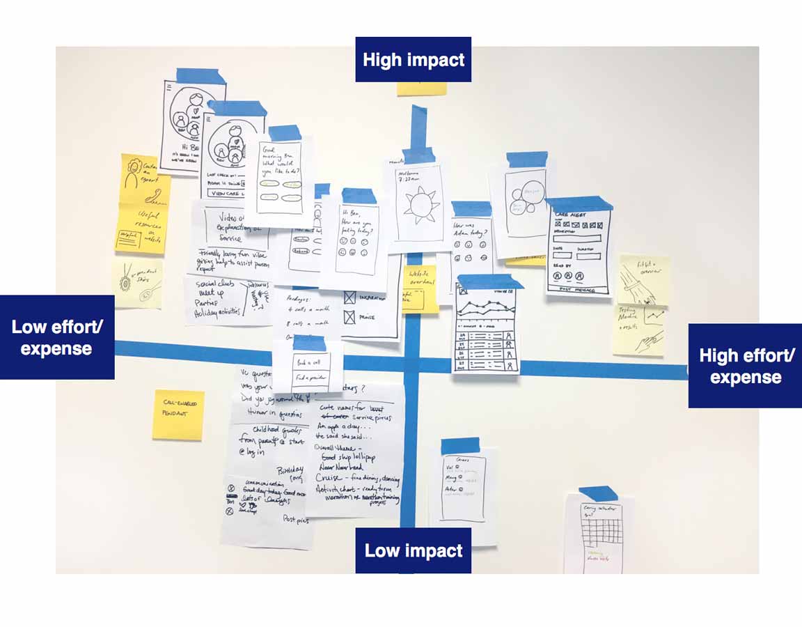
Initially we had what we call the ‘Care Circle’ (other carers) on the homepage. The biggest feedback coming out of this round of testing was that any updates about the person the carers care about most – their loved one – should be the first thing they see when opening the app.
An iterative approach into the future
Long-term we see great opportunities to evolve this communication tool to also empower the care recipient. Now it is a central information point, in three years it could support video messages and in 5-10 years it could be an integrated health tracker for care recipients to track their own health and progress.
Some of the questions that have cropped up along the way: How do we deal with issues of privacy? How do we keep information accurate, objective and easy to be interpreted? How could we extend this service for other types of users (care recipients who are smartphone savvy and care recipients who have a full-time carer present). These are issues for further exploration in the next chapter…
Ngaire Wex UX / UI Designer
Elsewhere online: